Interface: diferenças entre revisões
Sem resumo de edição |
Sem resumo de edição |
||
| Linha 8: | Linha 8: | ||
== Top left menu == | == Top left menu == | ||
{| style="width: 100%;" | |||
! style="text-align: center; font-weight: bold;" | [[File:Army.png|40px|link=]] | |||
! style="text-align: center; font-weight: bold;" | [[File:Icon_reward_age.png|link=]] | |||
|- | |||
| style="text-align: center; background-color: #7f0000;" | [[File:Campeao_Bronze.jpg|45px|link=Champion]] | |||
[[Champion]] | |||
| style="text-align: center; background-color: #7f0000;" | [[File:Icon_reward_military_unit_fast.png|link=Unit Types]] | |||
|} | |||
Revisão das 11h32min de 10 de julho de 2016
Introduction
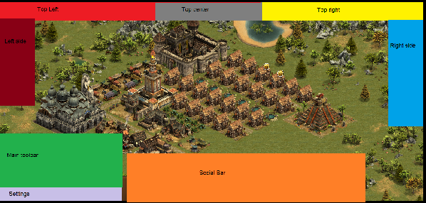
The Interface in Forge of Empires is very intuitive and separated into several areas
The top left menu will show the name of your city. If you click on the name, you will enter the town hall where you can change the name if you want.
Next on the menu is your current ranking. If you click on the ranking you will enter the ranking menu, where you can see where you and your guild rank among your competitors.
The available population is shown next, and if you roll the mouse over it, it will display total as well as available population in your city.
The last icon on the top left menu display the current happiness status of your city. If you roll the mouse over it, you will get a more detailed information about the happiness and how it affects the productivity in your city.

